
Transforming Photos
Credit to Zugzwang.in
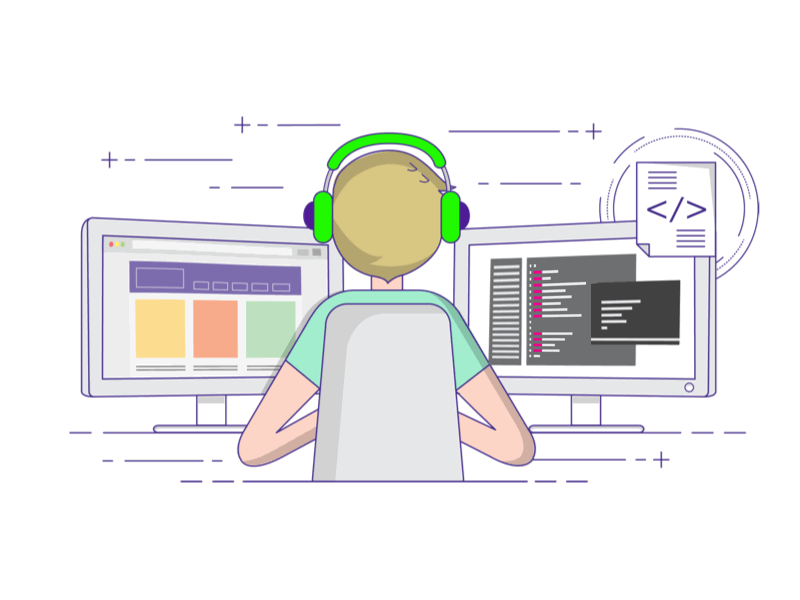
Although coding webpages themselves is a strenuous task, adding elements to complete the pages and inserting them accurately is seen as even harder. There are many websites out there on the internet dedicated to helping designers solve their problems and allow them to create beautiful websites that they can be proud of and show off their skills.
Nowadays, one cannot simply create a webpage to be seen on just a phone or computer screen, they must be able to be viewed on any platform, even television or tablet. I will take these tutorials and keep them in mind, as well as allow them to assist me on all my troubleshooting with image work, that is incredibly common in any coding project.
On Interneting Is Hard.com, they have several pages dedicated to helping others solve their coding woes. The page that enthralled me the most was the one on responsive images, which is what I’m currently working on for my web design course and I will take any help I can get. The thought never crossed my mind to calculate retina displays for the images I included but when they stated, “Retina screens have twice as many pixels per inch than standard-resolution screens. That is to say, each retina pixel is the equivalent of 4 standard pixels. This has a big impact on how images are displayed in a web browser. To render correctly on a retina device, an image needs to be twice as big as its final display dimensions”.
All platforms must be accounted and planned for before the coding is complete due to the fact that the images must work the same way and seen as the same quality across devices. Before reading this article, I would have imagined that one would simply just use the same image file for all devices to keep track of everything, but that’s never the case in design work. To have an effective campaign across all devices, I must use screensets in my coding. As it states on the webpage, “Image width alone isn’t enough for a device to determine which image it should load. We also need to tell it what the final rendered width of the image will be. That’s where the sizes attribute comes in. It defines a series of media queries along with the image’s rendered width when that media query is in effect”. Even though there are many moving parts to using screensets, it will inevitably make our life as designers easier when we create work for multiple platforms.